You might have seen a SAS Global Forum infographic floating around the web. And maybe you wondered how you might create something similar using SAS software? If so, then this blog's for you - I have created my own version of the infographic using SAS/Graph, and I'll show you how I did it!
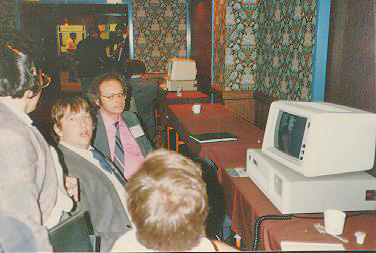
How about a little SAS history trivia first? ... Before it was called SAS Global Forum (SGF), SAS' annual international conference was called SAS Users' Group International (SUGI). My buddy Rick Langston is a fixture at these events, having attended 36 of the 42 SUGI/SGFs (1976-2017). And Rick came up with a cool vintage photo for me to share - this is a young-looking Paul Kent demoing SAS Version 6 on MS-DOS for users in Reno, using an IBM PC-AT. This was SUGI in March 1985, when SAS was first introducing the PC version of its software.
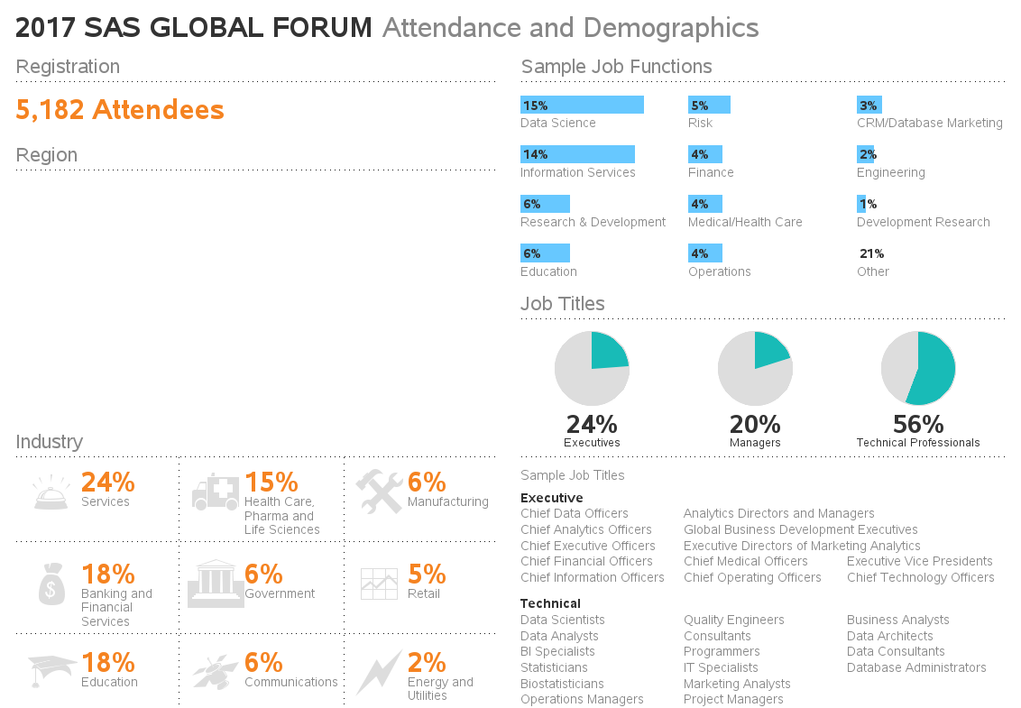
And now, back to the infographic - here's the original 2017 SAS Global Forum infographic. I didn't create this version, but it caught my eye. It's a sharp looking infographic, and one of my friends asked if I thought I could create something similar (and maybe even make a few improvements along the way). Challenge accepted!

As with many of my infographics and dashboards, I started by creating a custom Proc Greplay template, which allows me to place multiple graphs on the same page. Basically I used two graphs - a Proc GMap for the world map, and a Proc GSlide for everything else. Here's what the blank template looks like, with one large overall space, and then a smaller inset for the map:
Blank Template
![]() Next, I worked on the GSlide, which contains everything except the world map. This involved a lot of data-driven annotation. I used the annotate label function for the text, the bar function for the bars in the top/right, the pie function for the three pie charts, the move & draw functions for the dotted lines, and the label function again for the pictures in the bottom/left (specifying hex code characters from the Wingdings font). I could have hypothetically used Proc GChart for the bar charts and pie charts, but using the annotate version allowed me a little more flexibility for their custom layout. Here's the Gslide portion of my infographic:
Next, I worked on the GSlide, which contains everything except the world map. This involved a lot of data-driven annotation. I used the annotate label function for the text, the bar function for the bars in the top/right, the pie function for the three pie charts, the move & draw functions for the dotted lines, and the label function again for the pictures in the bottom/left (specifying hex code characters from the Wingdings font). I could have hypothetically used Proc GChart for the bar charts and pie charts, but using the annotate version allowed me a little more flexibility for their custom layout. Here's the Gslide portion of my infographic:
Everything Except Map
I then used Proc GMap to draw the world map, and annotated the numbers and labels at the desired latitude/longitude locations. I prepared the map by using Proc GProject and the gall projection to get the map in a visually pleasing layout (and cheated a little by using GMap's stretch option to have the map fill in the entire area). I used GProject's recently-added parmout option to save the map's projection parameters, so I could apply them separately to the annotated text (rather than having to combine the map and text, and project them together). If you're interested in the nitty-gritty details, here's a link to the complete SAS code.
And here is my final infographic! (you can click here to see the full size interactive version, with HTML mouse-over text)
Final Infographic
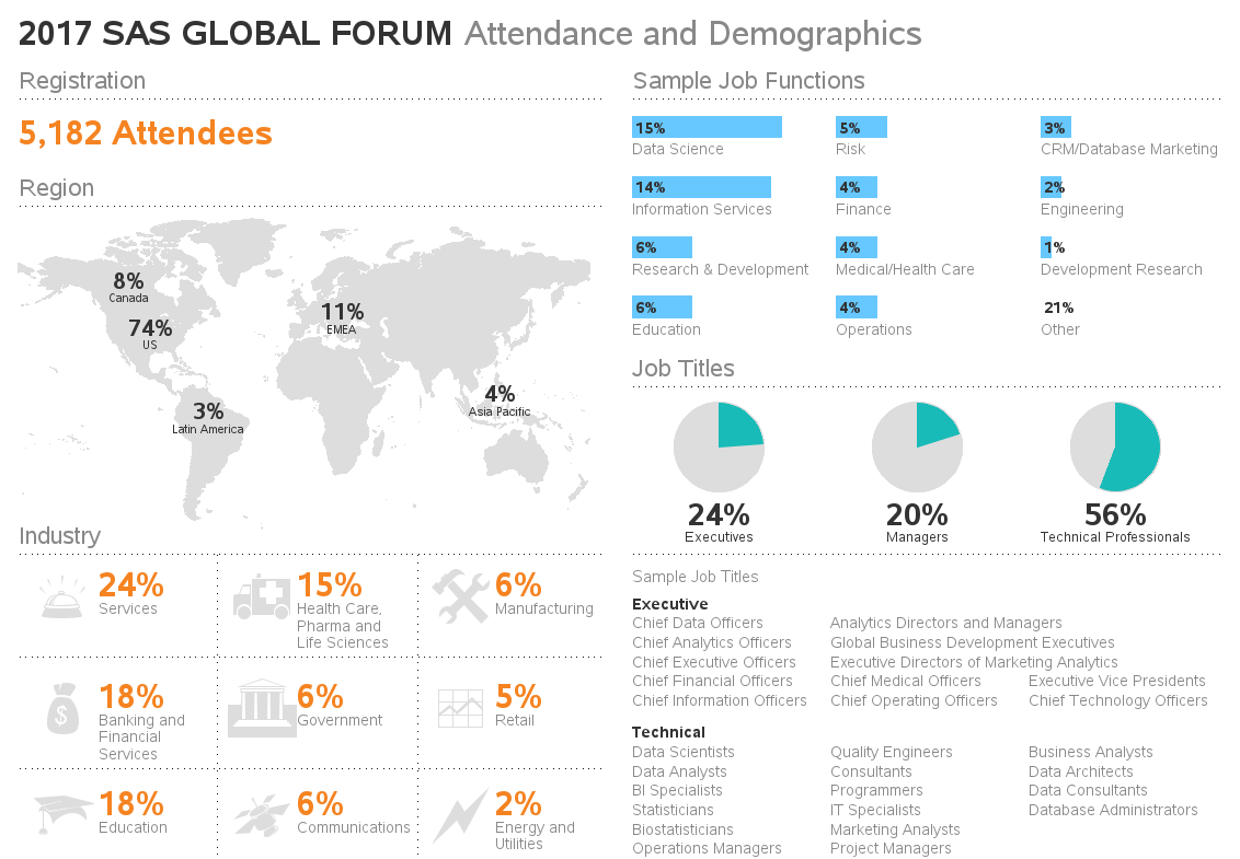
Did you notice the improvements between my version and the original? See if you can spot them all first, before reading the list below!
- I used a more complete / descriptive title.
- I programmatically calculated the lengths of the bars, so they are proportional to the data values.
- I used a single color for the bars, since the multiple colors didn't really have any significance.
- I used just the number, rather than a bar, for the 'Other' category, to de-emphasize it.
- And I kept the long Sample Job Titles on a single line, rather than splitting them into 2 lines.
Are you thinking "Wow - I didn't know SAS could do that!"? - Well now you know! :-)

38 Comments
wow, this is very cool...nice to know the real power of this software
I am pushing my mapping and graphing SAS skills because of your blog. Please keep posting examples.
That's what I like to hear! :)
Very nice!
Looking forward to trying out my hand in creating such info graphic reports
Thanks for sharing. Great work!
This is very nice, hopefully the integration with other SAS products will be easy.
Great work
Wow I didn't know SAS could do that!
This is why sas is above the rest
Nuce work!!! ... and a trip down memory lane, too ... SUGI - Rick Langston - SAS Version 6 - IBM PC-AT (Wasn't that supposed to slay the mainframe "dinosaur"?) ... oops, my age is showing.
Really nice design.
Good information too.
That is nice, seems to be very hardcoded, but I guess needs to be because of the purpose of emulating an existing infographic.
It's so great what SAS can do.
SAS can certainly do a lot more than I can imagine or even remember. Although I typically don't generate graphs with SAS and instead mainly use it to transform, analyze, and summarize data, it's very interesting to know about SAS's graphic capabilities.
Excellent. It is very interesting.
I didn't know SAS could do this, very cool!
Great! I don't think I could have done that with SAS without a lot, and I mean a lot, of work and reading before I even started. Some of the procs I didn't even knew about. Thanks
That is really a wonderful job and I didn't know that SAS could do that.
Thank you for sharing.
Awesome graphics! What a great tool to describe the SAS fauna.
Interesting!
Very cool!
Interesting, did not know that SAS can do something like this. This is where Art meets analytics.
Interesting!
really cool
Robert: Impressive as always! How come neither your's or the original infographic didn't list the manager job titles?
Hmm ... perhaps that level of detail wasn't in the source data?
I didn't have the source data, so I could only use what was in the original infographic! :)
Cool!
That is very nice! And I didn't know that SAS could do that.
Very, very nice piece of work !!!
Oher (21%) is missing a blue horizontal bar...
That's explained in the 4th bullet in the list, towards the end of the blog post.
Wow - I didn't know SAS could do that!
Great Stuff! Just one thing: for some reason I'm not getting the webding images under Industry. Any idea why?
You're running the SAS code on your computer, and not getting the Webding font images? Is the Webding font installed on your computer? (probably only available on Windows PCs?) And was SAS installed on your computer in the 'normal' way (in which cases all standard fonts on your PC should get registered to use in SAS ... otherwise you might have to run Proc Fontreg on them).
Thanks for the reply. I'm running Windows 10 on a pc (they recently updated us to 10). I do have the webdings font. I have no idea if SAS was installed on my computer in the 'normal' way. I did get the following warning:
WARNING: Font Webdings could not be used.
Font Albany AMT substituted for font Webdings.
Ahh - I haven't upgraded to Windows 10 yet, so I hadn't encountered this problem/difference. Based on this Microsoft page, looks like the Wingdings font isn't included in Windows 10 (only Wingdings2 and Wingdings3). https://support.microsoft.com/en-us/help/2121313/fonts-that-are-installed-with-microsoft-office-2010-products
If you can find the Wingdings.ttf font file somewhere, you can 'register' it so that your SAS session can use it by running code something like the following:
proc fontreg msglevel=verbose;
fontfile "WINGDINGS.TTF";
run;
Thanks for looking that up. But it's odd that in Excel/Word/Powerpoint I still have Webdings and Wingdings fonts.
Hmm ... perhaps there's more to it. This area is a bit 'fuzzy' for my expertise, so I recommend you run it by SAS Tech Support. They know much more about installing/configuring SAS on multiple platforms than I ever will! :)